Interface design: preplanned events #36
Description
I've never been a fan of what we came up with in v2 to enter preplanned events:
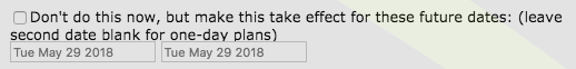
The fact that it appears below the rest of the interface, as a checkbox, seems like the wrong placement. You've all learned to use it over time, but there must be a better, more intuitive way.
Design ideas? Anyone want to take the lead on envisioning this, even if you aren't sure how to build it? That could involve soliciting ideas from users.