- Controle Alt Delete Gave us the opportunity to make a data visualisation about a survey they did in Amsterdam. The goal of the survey was to get insight about ethnich profiling in Amsterdam
- Click here to see our product biography
- Click here to see our design rationale
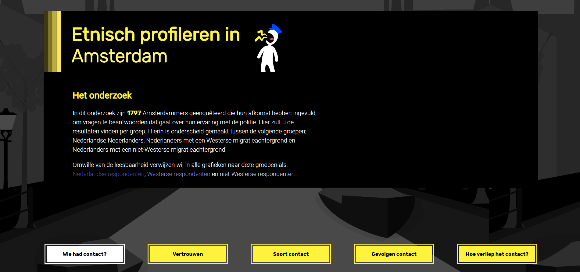
This project shows datavisualisations based on some survey questions that were asked to respondents that live in Amsterdam about the police. We devided the respondents into 3 groups:
- People with a dutch background (without any migration background)
- People with a non-Western migration background
- People with a Western migration background
We focus on the average trust grades in the police on a scale from 1-10 per group. You can explore through multiple datavisualisations about these groups to see why the grades are established like this. You will be able to see what kinds of things has lots of impact on the trust in the police.
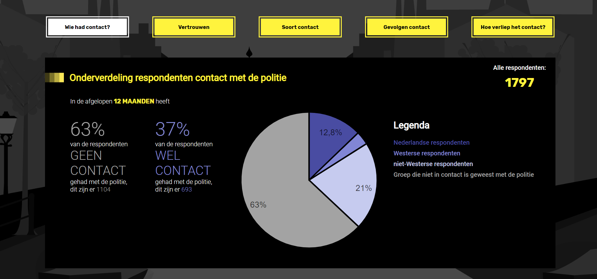
- Pie chart rendered with d3 about the distrubution who had contact with the police in the last 12 months
- Stacked bar chart rendered with d3 about the type of contact with the police
- with interaction in tooltip on hover, a pie chart will be rendered to show the distribution about the causes of the contact wit the police
- Dot matrix rendered with d3
- Users are able to select one of the consequences from the dropdown menu, the dots will reorganise
- Grouped bar chart rendered with d3
The survey contains 20 questions, some of them about the personal background of the person and most of the questions about the police. People were approached on the street who live in Amsterdam to fill in the survey.
We received the data we needed from the respondents from Controle Alt Delete in an Excel sheet. We made this into a .tsv so we could change this into JSON with d3.
To be able to use the data in d3, we needed to clean the data first. This meant:
- Only returning neccessary values
- Deviding the data into the 3 groups we mentioned earlier
- Deviding this data into 2 groups (contact or no contact with police in the last 12 months)
We opted for this approach, because we could re-use these groups in more complex data transformation functions. These more complex data transformations can be found in the transformation directory in the modules directory
These more complex data transformations included:
- Change ordinal values to numbers
- Calculating percentages and averages with these numbers
- Creating new objects with our transformed data
- We didn't use any frameworks because we felt like this wasn't needed for this project. We simply used plain Javascript.
- We did use some libraries;
- d3.v5.min.js
- to render the data visualisations
- d3-tip.js version 0.9.1
- To realize popups(tool tips) triggered on some of the hovers
- d3.v5.min.js
-
Example used for Pie chart: Pie chart
-
Examples used for Stacked Bar chart and Grouped Bar chart: Stacked Bar chart Normalized Stacked Bar chart
We have devided our project in multiple folders, these ones are:
- Modules - to create files to keep structure and overview in our project
- Inside this folder we have another folder called transformData that contains files to transform our data
- Public - this containes the fonts, images and css
In index.js we import all our modules.
We also use ESLint so we use the same rules and consitency for our code. This makes it easier to find bugs and makes it easier to work together on the project since we use the same coding style.
For further information what these rules do, please take a look at our product biography where this is further explained under the paragraph "Coding standards".
Run this command in your terminal:
git clone https://github.com/StefanGerrits2/ctrl-alt-delete
Run this command in your terminal:
cd ctrl-alt-delete
Open the index.html file in a browser.
You can't just open your
index.htmlfile because I use es6 modoules. You need to start a live server to make it work. For example, I use the pluginPreview on Web Server.
-
MDN - Main source for javascript code.
-
d3 - To use examples for d3
- Grouped bar chart example by Mike Bostock
- Stacked bar chart example by Mike Bostock
- Normalised stacked bar chart example by Mike Bostock
- Pie chart example by Mike Bostock
- Dot matrix by Gerardo Furtado, found in this stackOVerflow post
-
Controle Alt Delete - For general information and inspiration
-
Andy Kirk - Data Visualisation - To understand and use how you can create good data visualisations