Components: fix incorrect style of Guide component on mobile devices#33728
Conversation
 stokesman
left a comment
stokesman
left a comment
There was a problem hiding this comment.
Hi @arthur791004, thanks for finding and addressing this! (It appears the issue arose due to changes I made in #31639 🤦 ). Testing this out, I came across a couple of things that can be seen in this screenshot:
There can be horizontal scrolling (due to the image not resizing) and the next and previous buttons are able to overlay the guide content. The latter is apparently an existing issue and the former is due to the reduced min-width added in this PR.
I think I agree with the reduced min-width. I'd even favor no minimum width if we were to add style to make the image resize (it would want more than just max-width: 100%). As is, I think we can get away with hiding the overflow on the x-axis (though the graphic does get a bit off center). Alternatively, we could leave any min-width change out of this PR.
I'd like if we address the footer overlap in this PR too. It should do to just remove the position styles from components-guide__footer. That or adding styles to make the footer work without issue as an absolutely positioned element. The latter seems to have been the intent but I don't think the former has any objectionable effect and it's simpler.
|
@stokesman I've removed absolute positioning and also disabled the horizontal scrolling! |
|
@arthur791004, let me know if I've missed the reason we should (in this PR) change the |
|
@stokesman No, I just want to keep left and right margin at least |
stokesman
left a comment
There was a problem hiding this comment.
Great! To sum it up, this prevents the paging buttons from straying outside their parent and from overlaying the guide content in case of short viewports. Thanks again @arthur791004 🚀
|
Thanks @stokesman too 🙂 |
|
@stokesman Could you help to merge this? I don't have permission for it 😞 Thanks! |
|
@arthur791004, Thanks for the reminder on this. By the books we're supposed to have a core member’s approval before merging. I've requested a review from @jasmussen. |
 jasmussen
left a comment
jasmussen
left a comment
There was a problem hiding this comment.
This is testing well for me! I still do see a vertical scrollbar on this screen, but I doubt we can entirely eliminate such, at least there isn't a horizontal scrollbar.
Thanks for the PR, let's land it.
Thanks for the reminder on this. By the books we're supposed to have a core member’s approval before merging. I've requested a review from @jasmussen.
At this rate @stokesman I see no reason why you wouldn't count as a core member. Appreciate you going by the books, but in case you'd be interested, I doubt anyone would object to granting you core member status. You need only ask in #core-editor. Thanks for all your contributions!
Description
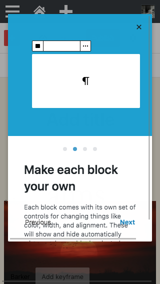
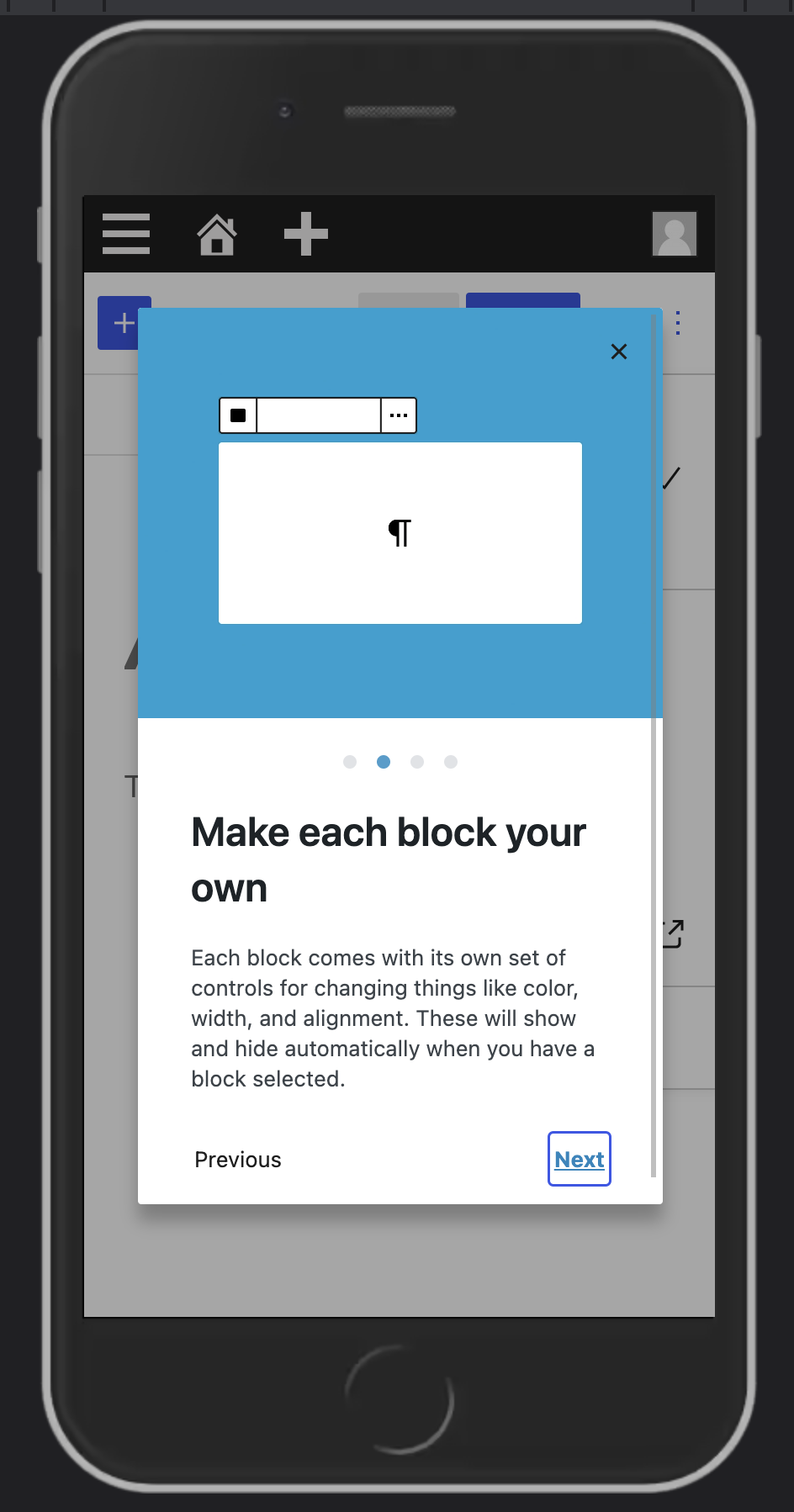
The Guide UI is broken on mobile devices, so update the styles to fix the problem
How has this been tested?
Screenshots
Before
After
Types of changes
Bug fix
Checklist:
*.native.jsfiles for terms that need renaming or removal).