
- Annotation + extension based responsive layout and design-system-friendly DX toolkit for Flutter. No
build_runnerrequired.
flutter_dsl lets you write crossplatform, responsive Flutter UI in a single chain — without deeply nested MediaQuery / LayoutBuilder trees and without code generation. Mark widgets with declarative annotations, layer per-property styling on top of design-system tokens, and branch by screen size with one line.
An internal DSL for Flutter that optimizes for everyday developer experience: responsive layout, design tokens, and styling chains in one cohesive, codegen-free package aligned to Material 3 windowing.
- One toolkit, not five. Responsive branching, a Material 3
ScreenSizeenum, design tokens (spacing/radius + theme text), and chainable styling — all from a single import, designed to work together. - No
build_runner, nodart:mirrors. Everything runs on const annotations and a runtimeInheritedWidget. Nothing to generate, no pipeline to maintain. - Material 3 windowing, first-class.
ScreenSize { compact, medium, expanded, large, extraLarge }is an exhaustive enum — the compiler won't let you forget a bucket. - Single source of truth. Configure breakpoints and design tokens once at the app root; every widget below reads them.
- Shallow trees by default.
.box(...)collapses several decorations into one node, andResponsive.value(...)adds zero wrappers on hot paths.
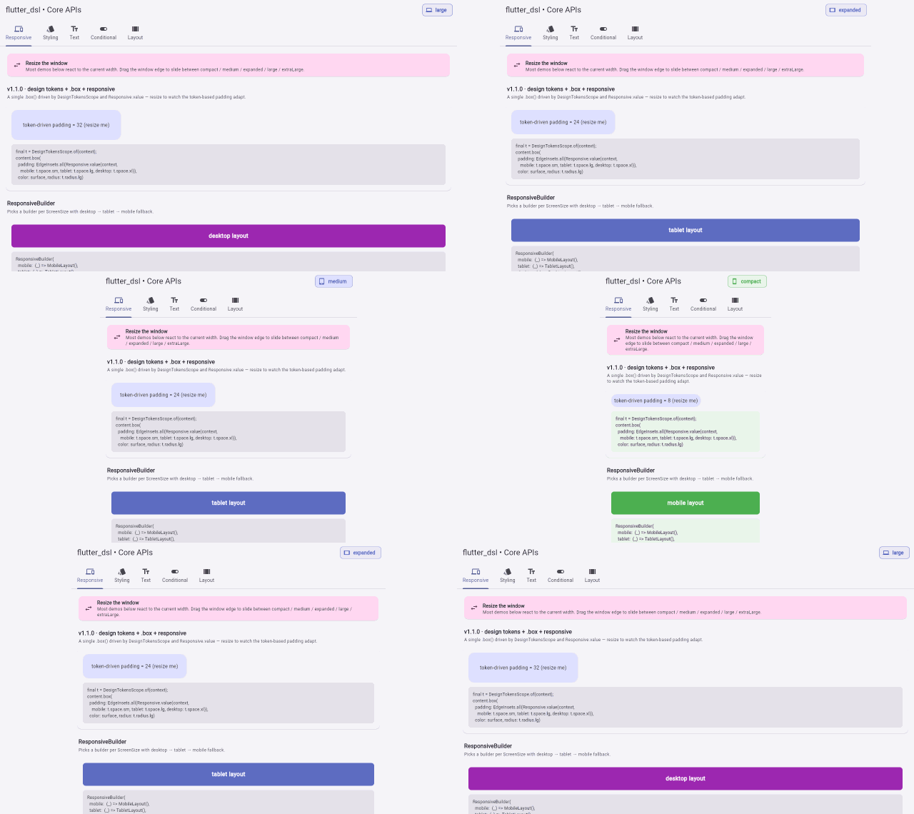
As the window narrows, the same single chain reflows across
compact → medium → expanded → large— layout, padding, and styling all adapt automatically. Explore every Core API live inexample/lib/main.dart.
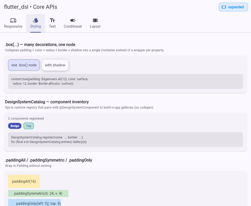
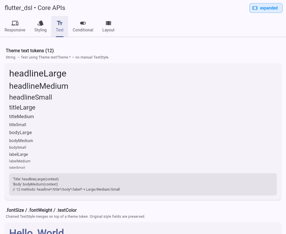
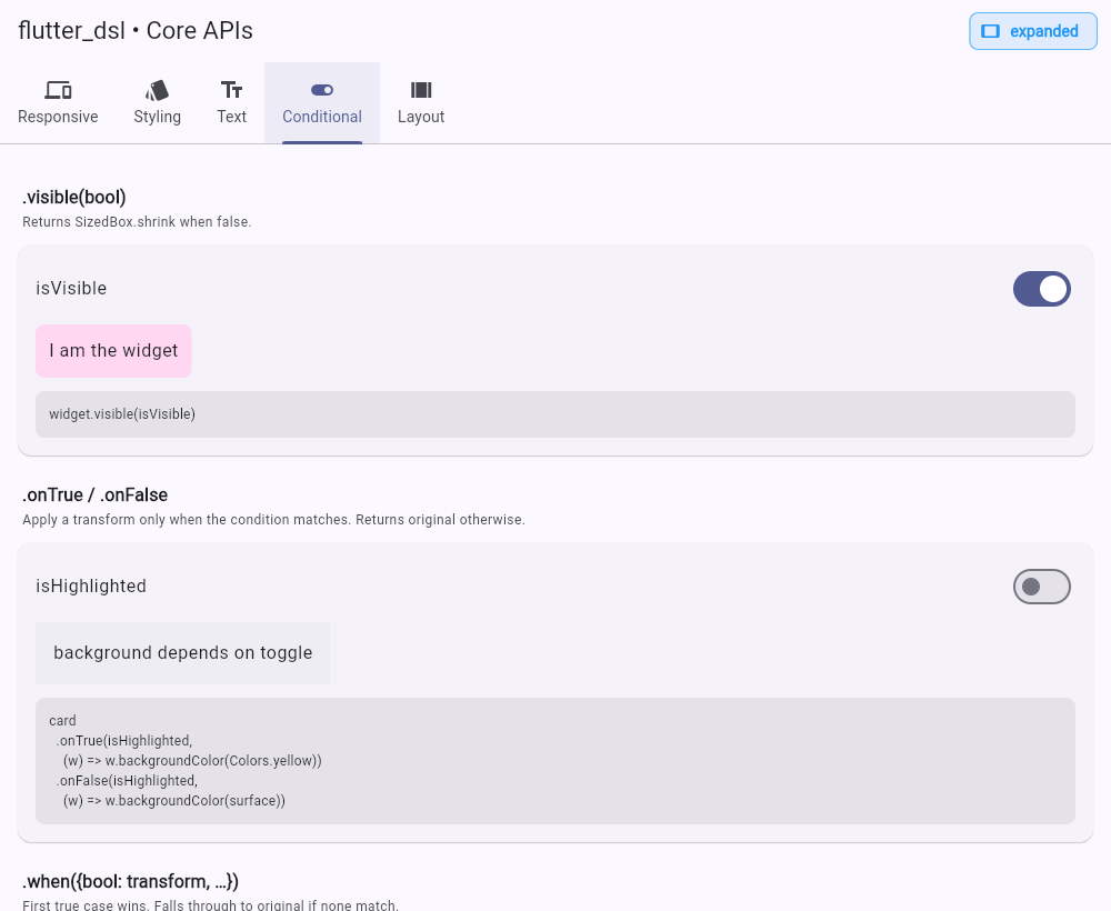
The other showcase tabs at a glance:
| Styling | Text |
|---|---|
 |
 |
| Conditional | Layout |
 |
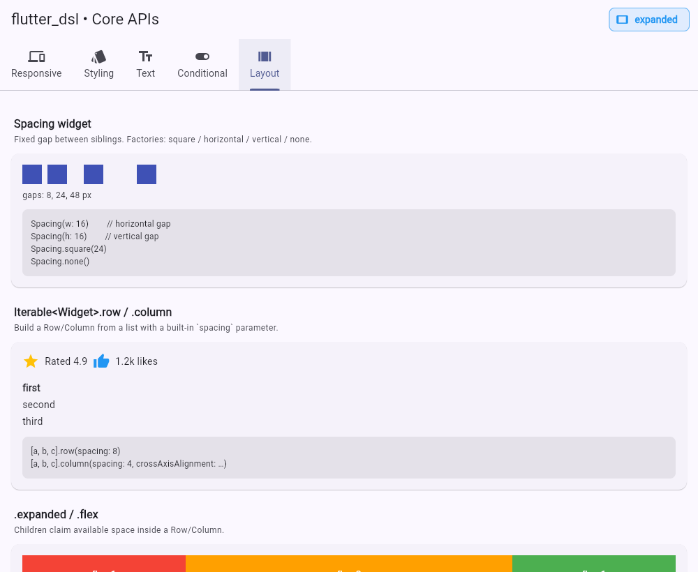 |
.box(...)— apply padding + color/gradient + border + corner radius + shadow in a singleContainer, instead of chaining a wrapper per property.- Design tokens:
DesignTokensScope+DesignTokenswith aSpacingScaleandRadiusScale, composing with the theme text tokens and the styling chains. DesignSystemCatalog— an opt-in, codegen-free runtime registry that pairs with@DesignSystemComponentto build in-app component galleries.- Fixed:
ResponsiveStatelessWidget/ResponsiveStatefulWidgetno longer override an ambientResponsiveScope; they resolve from the app-level scope (single source of truth). The per-widgetbreakpointsparameter is deprecated (removed in 2.0) — existing code keeps working with a deprecation hint.
v1.0 is a major pivot from the 0.1.x line. The previous "declarative UI helpers" overlap with what Flutter now ships natively, so v1.0 focuses on the layer above: responsive layout and design-system DX.
- Responsive primitives:
ResponsiveScope,ResponsiveBuilder,Responsive.value(...),.onMobile/.onTablet/.onDesktop/.hideOn*/.responsivechainable transforms. - Marker annotations:
@ResponsiveView,@DesignSystemComponent,@BreakpointOverride— documentation markers that pair with a base class (ResponsiveStatelessWidget) for responsive resolution; breakpoints are configured once onResponsiveScope. - Material 3 windowing:
ScreenSize { compact, medium, expanded, large, extraLarge }plus convenienceisMobile / isTablet / isDesktop. - Compact styling chains:
.fontSize/.fontWeight/.textColor/.italic/.underlineonText,.width/.height/.square/.constrained/.aspectRatioonWidget. - Functional conditionals:
.onTrue/.onFalse/.whenfor transforms (separate from.visiblefor visibility), plusWhenWidget<T>for value-dispatched widgets. - No
build_runner, nodart:mirrors— everything runs through const annotations + a runtimeInheritedWidget.
0.1.x APIs that conflict with the v1.0 direction are deprecated (still work, marked with @Deprecated) and will be removed in v2.0. See the migration table below.
dependencies:
  flutter_dsl: ^1.1.0
import 'package:flutter_dsl/flutter_dsl.dart';Wrap your app once in a ResponsiveScope (typically via MaterialApp.builder). This is the single source of truth for breakpoints — set them here, once:
MaterialApp(
  // Omit `breakpoints` to use the Material 3 defaults [600, 840, 1200, 1600].
  builder: (context, child) =>
      ResponsiveScope(breakpoints: const [600, 840, 1200, 1600], child: child!),
  home: const DashboardPage(),
);
Then write responsive widgets with the base class. Mark them with @ResponsiveView() for readability/tooling — the marker has no runtime effect on its own:
@ResponsiveView()
class DashboardPage extends ResponsiveStatelessWidget {
  const DashboardPage({super.key});

  @override
  Widget buildResponsive(BuildContext context, ScreenSize size) {
    return Scaffold(
      appBar: AppBar(title: 'Dashboard — ${size.name}'.titleLarge(context)),
      body: ResponsiveBuilder(
        mobile:  (c) => const MobileLayout(),
        tablet:  (c) => const TabletLayout(),
        desktop: (c) => const DesktopLayout(),
      ),
    );
  }
}
Or chain transforms inline:
'Hide on mobile, scale on desktop'
  .bodyMedium(context)
  .paddingAll(16)
  .backgroundColor(Theme.of(context).colorScheme.surfaceContainerHigh)
  .rounded(12)
  .onDesktop((w) => w.paddingAll(32))
  .hideOnMobile();
Or pick raw values with zero tree depth:
Padding(
  padding: EdgeInsets.all(
    Responsive.value(context, mobile: 16.0, tablet: 24.0, desktop: 40.0),
  ),
  child: ...,
);| API | Purpose |
|---|---|
ResponsiveScope({breakpoints, child}) |
Publishes a ScreenSize to the subtree via InheritedWidget. Default breakpoints are Material 3 [600, 840, 1200, 1600]. |
ResponsiveScope.of(context) |
Reads the resolved ScreenSize. Falls back to MediaQuery + Material 3 breakpoints when no scope is present, so it never crashes. |
ResponsiveScope.maybeOf(context) |
Like of but returns null when no scope is present. |
ResponsiveScope.dataOf(context) |
Returns ResponsiveData(size, width, breakpoints). |
ResponsiveStatelessWidget / ResponsiveStatefulWidget |
Base classes; implement buildResponsive(context, size). They resolve the ScreenSize from the ambient ResponsiveScope (the app-level single source of truth). |
ResponsiveBuilder({mobile, tablet?, desktop?}) |
Picks a builder per screen size, with desktop → tablet → mobile fallback. |
Responsive.value<T>(context, {mobile, tablet?, desktop?}) |
Picks a value (any T) per size. Zero wrapper widgets. |
Responsive.when(context, {mobile, tablet?, desktop?}) |
Picks a widget per size. Zero wrapper widgets. |
Responsive.isMobile/isTablet/isDesktop(context) |
Convenience flags. |
Chainable transforms (extensions on Widget):
widget.onMobile((w) => w.paddingAll(8))
widget.onDesktop((w) => w.constrained(maxWidth: 1080))
widget.hideOnDesktop()
widget.responsive(mobile: ..., tablet: ..., desktop: ...)@ResponsiveView()
@DesignSystemComponent(name: 'PrimaryButton', category: 'actions')
@BreakpointOverride([200, 500, 900, 1400])How the markers work.
@ResponsiveView,@DesignSystemComponent, and@BreakpointOverridedocument intent — for readers, IDE search, and inventory tooling — and pair with a runtime counterpart:@ResponsiveView()withextends ResponsiveStatelessWidgetto resolve aScreenSize, and@DesignSystemComponentwithDesignSystemCatalog.register(...)to enumerate components at runtime. There's nobuild_runnerand nodart:mirrorsby design, so configuration stays explicit — set breakpoints once on the app-levelResponsiveScope(one source of truth).The
breakpointsparameter on@ResponsiveView(...)/super(breakpoints: ...)is deprecated (it duplicates the scope config and is removed in 2.0).
'Heading'.titleLarge(context)        // design-system token
  .fontSize(28).fontWeight(FontWeight.w700)
  .textColor(Theme.of(context).colorScheme.primary);

myWidget.width(200).height(120).constrained(maxWidth: 400);
Each styling wrapper adds one widget node. When you need several decorations at once, prefer .box(...) — it collapses padding, background, border, corner radius, and shadow into a single Container:
// 3 wrapper nodes (Padding → ColoredBox → ClipRRect):
content.paddingAll(12).backgroundColor(surface).rounded(8);

// 1 node, same result:
content.box(padding: const EdgeInsets.all(12), color: surface, radius: 8);
Caveat:
.width(...)/.height(...)are shadowed bySizedBoxandImagebecause those types exposewidth/heightas instance fields. Wrap them once (e.g. inPadding,Center) before chaining.
Pair the theme-driven text tokens with a space / radius scale so spacing and corner radius come from one source instead of magic numbers. Publish a DesignTokensScope once near the app root (it falls back to Material-aligned defaults when absent):
MaterialApp(
  builder: (context, child) => DesignTokensScope(
    tokens: const DesignTokens(),                 // or customize the scales
    child: ResponsiveScope(child: child!),
  ),
);

// Anywhere below:
final t = DesignTokensScope.of(context);
'Card'.bodyLarge(context).box(
  padding: EdgeInsets.all(t.space.md),            // 16
  color: Theme.of(context).colorScheme.surface,
  radius: t.radius.lg,                            // 16
);
To turn @DesignSystemComponent into an in-app component gallery, register matching entries (no codegen):
DesignSystemCatalog.register(
  name: 'PrimaryButton', category: 'actions',
  builder: (_) => const PrimaryButton(),
);
for (final e in DesignSystemCatalog.entries) GalleryTile(entry: e);card.onTrue(isHighlighted, (w) => w.backgroundColor(Colors.yellow));
card.onFalse(isCompact, (w) => w.paddingAll(24));
card.when({
isError: (w) => w.backgroundColor(Colors.red),
isWarning: (w) => w.backgroundColor(Colors.orange),
});
WhenWidget<Status>(
value: status,
cases: {
Status.loading: () => const CircularProgressIndicator(),
Status.error: () => const Icon(Icons.error),
},
orElse: () => const SizedBox.shrink(),
);paddingAll/paddingSymmetric/paddingOnly, center/align/expanded/flex, rounded, backgroundColor (now ColoredBox internally), onTap, theme-aware Text tokens (headlineLarge … labelSmall), Spacing widget, Iterable<Widget>.row/column, and .visible(cond) are all kept.
| 0.x.x | 1.0.0 |
|---|---|
widget.marginAll(8) |
widget.paddingAll(8) or a Spacing in the parent |
'Hi'.text(fontSize: 18, color: Colors.red) |
'Hi'.bodyLarge(context).fontSize(18).textColor(Colors.red) |
'Hi'.withStyle(myStyle) |
Text('Hi', style: myStyle) |
iconA.gapRight(8) |
[iconA, ...].row(spacing: 8) |
widget.ifTrue(cond) (visibility) |
widget.visible(cond) |
widget.ifTrue(cond, orElse: () => other) |
cond ? widget : other or WhenWidget<bool>(value: cond, cases: {true: () => widget, false: () => other}) |
widget.ifFalse(cond) |
widget.visible(!cond) |
| (transform on condition) | widget.onTrue(cond, (w) => w.backgroundColor(Colors.yellow)) |
Deprecated 0.1.x APIs are still functional and marked with @Deprecated. They will be removed in v2.0.
A full v1.0 demo lives in example/lib/main.dart. Run it:
cd example
flutter run
Try resizing your window to see the responsive transforms kick in.
- Annotations document intent; runtime behavior comes from their counterparts (see above) — pair
@ResponsiveViewwithResponsiveStatelessWidget, and@DesignSystemComponentwithDesignSystemCatalog. Breakpoints live on the app-levelResponsiveScope(one source of truth). Nobuild_runner/dart:mirrors. - Each styling/transform wrapper adds one widget node. A long chain trades deep nesting for deep chaining, which is harder to read in the widget inspector and to break on. Keep chains short; for multiple decorations use
.box(...)(oneContainer); for hot paths use theResponsive.value/Responsive.whenstatic helpers — they take aBuildContextand add no nodes. Text styling (.fontSize,.textColor, …) and conditionals (.onTrue,.when, …) do not add nodes — they merge/return in place. Text.richis not supported by the text styling chains (.fontSize,.textColor, …). Construct aTextSpanwith the style you want instead.- 0.1.x → 1.0.0 is a major version bump that signals the direction pivot. If you depend on
^0.1.x, update the constraint and read the migration table.
Issues and PRs are welcome. Please open an issue first for larger changes.
MIT License © 2025-2026 HARDY