


Building a select in React Native looks simple — until it meets a real app. Small screens, layered rendering contexts, and platform quirks turn a basic dropdown into a source of edge-case bugs that are painful to track down.
@tenkaipl/react-native-select was built to handle these contexts correctly out of the box:
- Plain Views — opens and positions correctly regardless of where the component sits in the layout
- ScrollView / FlatList — no conflicts with gesture or tap interception (see ScrollView compatibility below)
- Modal — proper z-index handling; the list never hides behind other UI layers
- On-screen keyboard — the dropdown doesn't collide with an open keyboard
- Landscape orientation — adapts gracefully to limited vertical space
- SafeArea — respects safe areas on notched and edge-to-edge devices
A fully customizable select/dropdown for React Native. Inspired by react-select, built for native environments.
 |
 |
 |
 |
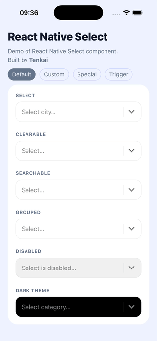
✨ Single select · search · clear · groups · disabled · dark theme
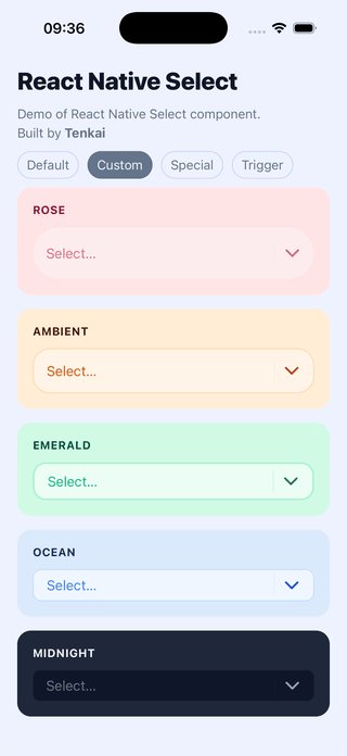
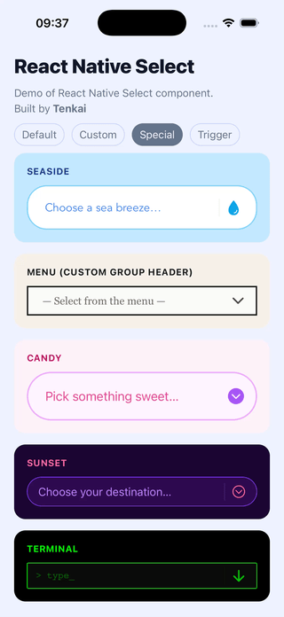
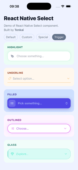
🎨 Custom colors, sizes, typography, icons, trigger, group header
📱 Native-first — keyboard, modal, layout handled correctly
⚡ Works with Expo & bare React Native
→ See all examples in the repository
import React, { useState } from 'react';
import ReactNativeSelect from '@tenkaipl/react-native-select';

const OPTIONS = [
  { value: 'apple',  label: 'Apple' },
  { value: 'banana', label: 'Banana' },
  { value: 'cherry', label: 'Cherry' },
];

export default function App() {
  const [value, setValue] = useState(null);

  return (
    <ReactNativeSelect
      options={OPTIONS}
      value={value}
      onChange={(item) => setValue(item.value)}
      placeholder="Select a fruit..."
      searchable
      clearable
    />
  );
}npm install @tenkaipl/react-native-select react-native-safe-area-context @expo/vector-icons Wrap your app root with SafeAreaProvider. Without it, modal layout may be off on notched devices.
import { SafeAreaProvider } from 'react-native-safe-area-context';

export default function App() {
  return (
    <SafeAreaProvider>
      {/* your app */}
    </SafeAreaProvider>
  );
}ScrollView, FlatList, or SectionList: please add keyboardShouldPersistTaps="handled" to the parent:
<ScrollView keyboardShouldPersistTaps="handled">
  <ReactNativeSelect ... />
</ScrollView>
Without it, the first tap on an option dismisses the keyboard instead of selecting — you'd need a second tap. This is caused by how React Native's touch responder system works: the parent ScrollView intercepts the first tap even when the select renders inside a Modal.
Same as the Quick example above. onChange receives the full option object { value, label } — store whichever part you need.
const OPTIONS = [
  { type: 'group',  label: 'Fruits' },
  { type: 'option', value: 'apple',  label: 'Apple' },
  { type: 'option', value: 'banana', label: 'Banana' },
  { type: 'group',  label: 'Vegetables' },
  { type: 'option', value: 'carrot',   label: 'Carrot' },
  { type: 'option', value: 'broccoli', label: 'Broccoli' },
];
During search, group headers are shown only when at least one of their options matches the query.
If your data comes from an API in nested format, use the built-in helper:
import ReactNativeSelect, { flattenGroupedOptions } from '@tenkaipl/react-native-select';

const GROUPED_DATA = [
  {
    label: 'Fruits',
    options: [
      { value: 'apple',  label: 'Apple' },
      { value: 'banana', label: 'Banana' },
    ],
  },
  {
    label: 'Vegetables',
    options: [{ value: 'carrot', label: 'Carrot' }],
  },
];

// Static data — flatten once, outside the component
const OPTIONS = flattenGroupedOptions(GROUPED_DATA);

// Dynamic data (e.g. fetched) — use useMemo
// const options = useMemo(() => flattenGroupedOptions(data), [data]);// Regular option (selectable)
{ type?: 'option', value: string | number, label: string }
// Group header (non-selectable, skipped during search matching)
{ type: 'group', label: string }type is optional for regular options — plain { value, label } objects work as-is.
| Prop | Type | Default | Description |
|---|---|---|---|
options |
Option[] |
[] |
List of options. See Options format. |
value |
string | number | null |
— | Currently selected value (not the full object). |
onChange |
(item: Option) => void |
— | Called when the user selects an option. Receives the full { value, label } object. |
placeholder |
string |
'' |
Text shown in the trigger when nothing is selected. |
placeholderText |
string |
'No results' |
Text shown in the list when the filtered result is empty. |
| Prop | Type | Default | Description |
|---|---|---|---|
searchable |
boolean |
false |
Enables the search input inside the modal. |
clearable |
boolean |
false |
Shows a clear (×) button when a value is selected or search text is present. |
disabled |
boolean |
false |
Disables the trigger and prevents the dropdown from opening. |
autoFocus |
boolean |
true |
Focuses the search input when the modal opens. On Android handled via onShow + setTimeout. |
animationType |
'fade' | 'slide' | 'none' |
'fade' |
Animation used by the underlying <Modal>. |
transparent |
boolean |
true |
Controls the transparent prop of <Modal>. |
cursorColor |
string | null |
null |
Cursor color of the search TextInput. |
pressedOpacity |
number |
0.6 |
Opacity applied to all Pressable elements when pressed. |
hideDivider |
boolean |
false |
Hides the vertical separator between action buttons and the chevron. |
hideItemSeparator |
boolean |
false |
Hides horizontal separators between list items. |
itemLabelSingleLine |
boolean |
false |
Renders option labels as a single line with ellipsis instead of wrapping. |
autoCorrect |
boolean |
false |
Controls autoCorrect on the search TextInput. |
spellCheck |
boolean |
false |
Controls spellCheck on the search TextInput. Note: when enabled, the first tap on the clear button may not register. |
| Prop | Type | Description |
|---|---|---|
renderTrigger |
({ onPress, disabled, selectedLabel, hasValue, onClear }) => ReactNode |
Fully replaces the default trigger button. |
renderGroupHeader |
({ item }) => ReactNode |
Replaces the default group header row. |
| Prop | Type | Default | Description |
|---|---|---|---|
theme |
'light' | 'dark' |
'light' |
Base color preset. |
colors |
Partial<Colors> |
{} |
Overrides individual colors. Merged with the active theme. See Colors. |
sizes |
Partial<Sizes> |
{} |
Overrides dimensions. See Sizes. |
typography |
Partial<Typography> |
{} |
Overrides font settings. See Typography. |
icons |
Partial<Icons> |
{} |
Overrides icon names (Ionicons). See Icons. |
| Prop | Type | Description |
|---|---|---|
triggerStyle |
ViewStyle |
Additive style applied to the trigger container. |
dropdownStyle |
ViewStyle |
Additive style applied to the dropdown container. |
itemStyle |
ViewStyle |
Additive style applied to each option row. |
groupHeaderStyle |
ViewStyle |
Additive style applied to each group header row. |
⚠️ These are additive overrides — they do not replace internal styles. Overridingheight,flex,overflow, or positioning properties may break the layout.
| Key | Description |
|---|---|
primary |
Background of the trigger and dropdown. |
secondary |
Color of the chevron and close icons. |
colorTextPrimary |
Color of the selected label and option text. |
colorTextSecondary |
Color of the placeholder and group header text. |
lines |
Color of separators. Used as borderColor if border is not set. |
border |
(optional) Explicit border color. Falls back to lines if omitted. |
disabled |
Background of the trigger when disabled={true}. |
shadow |
shadowColor / elevation color. |
selected |
Background of the selected option row. |
| Key | Default | Description |
|---|---|---|
triggerMinWidth |
180 |
Minimum width of the trigger. |
itemHeight |
50 |
Height of each row (trigger, option rows, search bar). Clamped between 35–70. |
maxListWidth |
600 |
Maximum width of the dropdown. |
maxListHeight |
undefined |
Maximum height of the dropdown. |
separatorWidth |
hairlineWidth |
Height of horizontal separators. |
borderRadius |
15 |
Border radius of the trigger and dropdown. |
borderWidth |
hairlineWidth |
Border width of the trigger and dropdown. |
iconSize |
24 |
Size of the chevron and close icons. |
inputPaddingLeft |
15 |
Left padding of the text / search input. |
inputPaddingRight |
5 |
Right padding inside the trigger and search bar. |
itemPaddingHorizontal |
15 |
Horizontal padding of option and group header rows. |
itemHeight is clamped between 35 and 70. The lower bound exists because Android breaks the TextInput layout in the search bar at smaller heights.
| Key | Default | Description |
|---|---|---|
fontSize |
16 |
Font size for option labels, placeholder, and group header text. |
fontFamily |
undefined |
Font family applied to all text inside the component. |
Icon names from @expo/vector-icons Ionicons.
| Key | Default | Description |
|---|---|---|
chevron |
'chevron-down' |
Icon on the right side of the trigger and modal header. |
close |
'close' |
Icon for the clear button. |
- Multi-select
- Async options (loadOptions)
- Creatable (add a new option not in the list)
- Fixed options
- RTL – Support for right-to-left languages
- Colored list items
- Inline autocomplete (ghost text)
- onSubmit – select the best match on Enter / search submit
- Keyboard navigation (for web)
- Animations during filtering
- More efficient list rendering for large option sets (maybe using FlashList)
If you're coming from a web project, here's where things stand:
| Feature | react-select | React Native Select |
|---|---|---|
| Single select | ✅ | ✅ |
| Searchable | ✅ | ✅ |
| Clearable | ✅ | ✅ |
| Disabled state | ✅ | ✅ |
| Option groups | ✅ | ✅ |
| Multi-select | ✅ | ❌ planned |
| Async options | ✅ | ❌ planned |
| Creatable | ✅ | ❌ planned |
| Platform | Supported |
|---|---|
| iOS | ✅ |
| Android | ✅ |
| Web | ✅ |
| Expo | ✅ |
This is v1. The core API and behavior are stable; some edge cases and advanced features are still being refined.
If something doesn't work as expected — especially on specific screens (modals, lists, keyboard-heavy views) — please open an issue. Real-world edge cases are exactly what this library is designed to solve.
MIT — see LICENSE.
- react-native
- expo
- react native select
- react native dropdown
- custom select
- custom dropdown
- headless ui
- react native picker alternative
Built by Tenkai Software House 🇵🇱