Skip to content

Match the primary button disabled state to Core's color contrast#16103

Merged
mapk merged 9 commits into
masterfrom
fix/disabled-primary-button-color
Jul 11, 2019
Merged

Match the primary button disabled state to Core's color contrast#16103
mapk merged 9 commits into
masterfrom
fix/disabled-primary-button-color

Conversation

@mapk
Copy link
Copy Markdown
Contributor

@mapk mapk commented Jun 12, 2019

Description

See #15280. This fixes the primary button's disabled view to match Core's primary disabled buttons. It should help the a11y issue raised in #15280.

Oh, it also fixes the default button state to match Core's too.

How has this been tested?

Locally.

Screenshots

BEFORE

Screen Shot 2019-06-11 at 6 00 47 PM

AFTER

Screen Shot 2019-06-11 at 5 53 45 PM

Types of changes

Minor CSS changes tweaking shade and tints of disabled buttons.

Checklist:

  • My code is tested.
  • My code follows the WordPress code style.
  • My code follows the accessibility standards.
  • My code has proper inline documentation.
  • I've included developer documentation if appropriate.

@mapk
Copy link
Copy Markdown
Contributor Author

mapk commented Jun 12, 2019

For comparison, @melchoyce included a mockup in the issue. Here it is below.

core

@mapk mapk self-assigned this Jun 12, 2019
@mapk mapk added Needs Accessibility Feedback Need input from accessibility Needs Design Feedback Needs general design feedback. labels Jun 12, 2019
@mapk
Copy link
Copy Markdown
Contributor Author

mapk commented Jun 12, 2019

Here's what the disabled primary button looks like in the Customizer currently for further comparison.

Screen Shot 2019-06-11 at 6 13 46 PM

Copy link
Copy Markdown
Contributor

@kjellr kjellr left a comment

Choose a reason for hiding this comment

The reason will be displayed to describe this comment to others. Learn more.

This is super close. Two things:

For the primary button, I noticed I can still click it. 🤔

opt-6

Should that active state be removed?

Also, the primary button hex values are very close to the ones used in core, but they're not exact. Is there any way we can get those to match up exactly?

This PR:
Screen Shot 2019-06-11 at 6 19 06 PM

Core:
https://github.com/WordPress/WordPress/blob/935c35fe34d196ce7f62f8229a69d917c2f596fb/wp-includes/css/buttons.css#L277-L279

@mapk
Copy link
Copy Markdown
Contributor Author

mapk commented Jun 12, 2019

For the primary button, I noticed I can still click it.

@kjellr I wasn't sure about changing the behavior because the a11y issue didn't offer suggestions for it. The only way I'm aware of how to do this is adding the disabled="disabled" attribute to the button. Is this correct?

Also, the primary button hex values are very close to the ones used in core, but they're not exact.

True. I'm dealing with tint/shade percentages here on color(theme(button)) variables, so I'm kind of firing in the dark. I can work on adjusting them to get closer. Do you know if Core uses Sass tint/shades or is it hard coded hex values?

&:disabled,
	&[aria-disabled="true"] {
		color: color(theme(button) tint(50%));
		background: color(theme(button) tint(5%));
		border-color: color(theme(button) shade(20%));
		box-shadow: none;
		text-shadow: 0 -1px 0 rgba(0, 0, 0, 0.1);
	}

@mapk
Copy link
Copy Markdown
Contributor Author

mapk commented Jun 12, 2019

I'm so stinking close on this, @kjellr, but the percentage tint/shade Sass change isn't allowing me to nail it. Do you suggest swapping out to hex values, or will that be too problematic for theming the editor (if that's what those variables are for)?

This is where I'm at right now:

Core hex values

core-customizer-disabled

Gutenberg hex values

Screen Shot 2019-06-11 at 8 14 06 PM

@youknowriad
Copy link
Copy Markdown
Contributor

Would be good to test this with other profile color schemes as well.

@kjellr
Copy link
Copy Markdown
Contributor

kjellr commented Jun 12, 2019

Do you know if Core uses Sass tint/shades or is it hard coded hex values?

It looks like for the color schemes, the disabled states are generated using the following mixin:

https://github.com/WordPress/wordpress-develop/blob/f3c91893a998154ccae2c5177777f924e4ef1e50/src/wp-admin/css/colors/_mixins.scss#L37-L45

We unfortunately can't use the exact same code here, since they require actual color values as inputs, not something like color(theme(button)). 😞

@mapk
Copy link
Copy Markdown
Contributor Author

mapk commented Jun 12, 2019

All wp-admin profile color schemes work great.

Blue

blue

Blue : disabled

blue-disabled

Coffee

coffee

Coffee : disabled

coffee-disabled

Ectoplasm

ectoplasm

Ectoplam : disabled

ectoplasm-disabled

Midnight

midnight

Midnight : disabaled

midnight-disabled

Ocean

ocean

Ocean : disabled

ocean-disabled

Sunrise

sunrise

Sunrise : disabled

sunrise-disabled

@enriquesanchez
Copy link
Copy Markdown
Contributor

This looks like a big improvement to me 👍

I wasn't sure about changing the behavior because the a11y issue didn't offer suggestions for it. The only way I'm aware of how to do this is adding the disabled="disabled" attribute to the button. Is this correct?

I'm also not 100% sure about this. I'd love to get a second opinion here.

@afercia
Copy link
Copy Markdown
Contributor

afercia commented Jun 13, 2019

adding the disabled="disabled" attribute to the button.

In a few places, Gutenberg tries to avoid to use a disabled attributes because setting it on a button that has the current focus would produce a focus loss for keyboard users, including users of assistive technologies who use the keyboard or devices that mimics the keyboard.

When there are good reasons to do so, disabled controls can still be focusable, see:

5.7 Focusability of disabled controls
https://www.w3.org/TR/wai-aria-practices-1.1/#kbd_disabled_controls

Please refer to previous issues and discussions on this topic.

@afercia afercia added [Focus] Accessibility (a11y) Changes that impact accessibility and need corresponding review (e.g. markup changes). and removed Needs Accessibility Feedback Need input from accessibility labels Jun 13, 2019
@mapk
Copy link
Copy Markdown
Contributor Author

mapk commented Jun 14, 2019

Thanks, @afercia, that's what I was looking for.

When there are good reasons to do so, disabled controls can still be focusable, see:

I believe this primary button is a good reason to do so. I'll look into the link and figure out if something can be done here.

@mapk
Copy link
Copy Markdown
Contributor Author

mapk commented Jun 14, 2019

I couldn't quite figure out how to add disabled="disabled" to the buttons AND still keep the keyboard focus. So alternatively, I chose to just rework the CSS to include the :active state like so and it works just fine:

&:disabled,
&:disabled:active:enabled,
&[aria-disabled="true"],
&[aria-disabled="true"]:active:enabled {
	color: color(theme(button) tint(40%));
	background: color(theme(button));
	border-color: color(theme(button) shade(7%));
	box-shadow: none;
	text-shadow: none;
}

inactive

@kjellr
Copy link
Copy Markdown
Contributor

kjellr commented Jun 17, 2019

This looks great, thanks @mapk. I think the color is close enough to core that we can just keep as is.

The only minor issue I'm seeing is with the :focus state. Currently, the button appears actionable on focus:

button

Instead, I think we I think should keep the appearance in its disabled state, but add the outer focus borders:

Screen Shot 2019-06-17 at 8 32 41 AM

@mapk
Copy link
Copy Markdown
Contributor Author

mapk commented Jun 25, 2019

This last little change looks like below. It keeps the disabled text color when focused.

primary-focus

@kjellr I had to add this CSS in a slightly awkward area b/c I couldn't get it working by keeping it all in the disabled button section. What do you think?

@mapk
Copy link
Copy Markdown
Contributor Author

mapk commented Jun 25, 2019

Danggit. I think I missed restricting the border addition on focus.

@mapk
Copy link
Copy Markdown
Contributor Author

mapk commented Jun 26, 2019

Got it the colors working now.

primary

Copy link
Copy Markdown
Contributor

@kjellr kjellr left a comment

Choose a reason for hiding this comment

The reason will be displayed to describe this comment to others. Learn more.

Thank you, @mapk!

@kjellr I had to add this CSS in a slightly awkward area b/c I couldn't get it working by keeping it all in the disabled button section. What do you think?

Yeah, I think it'd make sense to keep these styles alongside the other disabled styles. We can accomplish that by having those focus:enabled styles nested inside of the :disabled section. I've pushed a tiny change to take care of that. 👍

Re-reading through all the other comments, I'm fairly certain this is good to go. I'll merge in as soon as the tests pass. Thanks for your work on this!

Copy link
Copy Markdown
Contributor

@kjellr kjellr left a comment

Choose a reason for hiding this comment

The reason will be displayed to describe this comment to others. Learn more.

Hmm actually — I noticed that all the secondary admin color schemes show their box shadows & text shadows. We'll need to override these. 🤔

clicking

text-shadow: 0 -1px 0 rgba(0, 0, 0, 0.1);
text-shadow: none;

// This specificity is needed to override alternate color schemes in WP-Admin.
Copy link
Copy Markdown
Contributor

Choose a reason for hiding this comment

The reason will be displayed to describe this comment to others. Learn more.

Hmm actually — I noticed that all the secondary admin color schemes show their box shadows & text shadows. We'll need to override these. 🤔

clicking

I pushed a tiny update that fixes this by using a little extra specificity. We can probably count on all buttons in Gutenberg having that is-button class, so I think that'll work fine for us. I'd love a gut check from someone else though before merging. @jasmussen do you have a moment to take a look by any chance?

Copy link
Copy Markdown
Contributor

Choose a reason for hiding this comment

The reason will be displayed to describe this comment to others. Learn more.

I'm not completely sure what to look for. But here's a before:
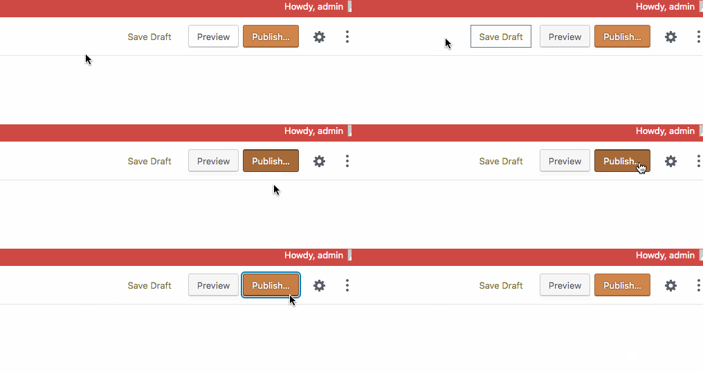
before

Here's an after:

after

Both look good to me.

It's always a bummer that we need to add specificity. But until we can improve the code quality of buttons across WordPress, we have to, so on that note it's fine.

Copy link
Copy Markdown
Contributor

Choose a reason for hiding this comment

The reason will be displayed to describe this comment to others. Learn more.

Ah, sorry — take a look at that when the button is disabled. 🙂

Before:

current

After:

new

This is more in line with the disabled blue button colors in the PR:

new2

The specificity is probably okay, and if you didn't notice any differences in the non-disabled state, that probably means it didn't break anything important. 😄

Copy link
Copy Markdown
Contributor Author

Choose a reason for hiding this comment

The reason will be displayed to describe this comment to others. Learn more.

I just tested the changes as well, @kjellr. Everything worked well. Can I get an approval on this PR?

Copy link
Copy Markdown
Contributor

Choose a reason for hiding this comment

The reason will be displayed to describe this comment to others. Learn more.

😄 Yep, I didn't want to approve it myself before, since I'd last made some changes to it. If we're both in agreement though, this is good to land! I'll add a comment.

@mapk mapk removed the Needs Design Feedback Needs general design feedback. label Jul 11, 2019
Copy link
Copy Markdown
Contributor

@kjellr kjellr left a comment

Choose a reason for hiding this comment

The reason will be displayed to describe this comment to others. Learn more.

🚢

@mapk mapk merged commit 1e9225a into master Jul 11, 2019
@mapk
Copy link
Copy Markdown
Contributor Author

mapk commented Jul 11, 2019

Thanks everyone! 🎉

@kjellr kjellr deleted the fix/disabled-primary-button-color branch July 11, 2019 16:48
&:disabled,
&[aria-disabled="true"] {
cursor: default;
opacity: 0.3;
Copy link
Copy Markdown
Member

Choose a reason for hiding this comment

The reason will be displayed to describe this comment to others. Learn more.

This change causes all disabled buttons which aren't one of the WordPress-styled variants to appear the same as a non-disabled button.

For example, in a new post, the Undo/Redo buttons appear now at full opacity.
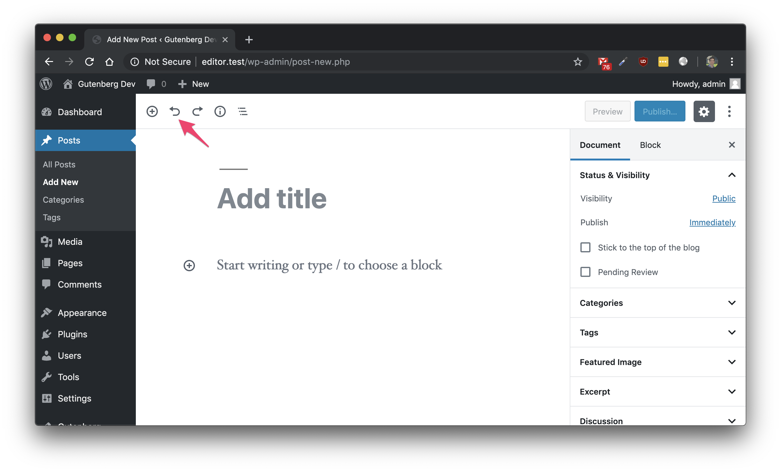
image

Copy link
Copy Markdown
Member

Choose a reason for hiding this comment

The reason will be displayed to describe this comment to others. Learn more.

See #16769

Sign up for free to join this conversation on GitHub. Already have an account? Sign in to comment

Labels

[Focus] Accessibility (a11y) Changes that impact accessibility and need corresponding review (e.g. markup changes).

Projects

None yet

Development

Successfully merging this pull request may close these issues.

8 participants